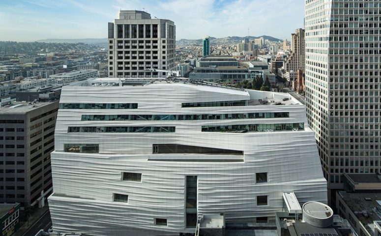
The San Francisco Museum of Modern Art brands its new wing as so much fog—just watch the video on its website and listen to Snøhetta’s lead architect, Craig Dykers. This isn’t a bad thing, but it is rare. The last time mist was form was Diller Scofidio’s Blur Building at Swiss Expo 2002. But that was mist as spectacle. The new expansion is quite the opposite, which is what makes it interesting. It is architecture that almost wants to disappear. Snøhetta, with local architect EHDD, has created a building that seems to take the core ideas of artists of the Southern California Light and Space movement, like James Turrell and Robert Irwin, and make them three-dimensional.
The key architectural challenge facing SFMOMA was whether to keep Mario Botta’s building, which opened in 1995. Mario Botta, like other world-famous architects, including Fumihiko Maki, Philip Johnson, Pei Cobb Freed & Partners, Ricardo Legorreta, César Pelli (at Mission Bay), and even the great Renzo Piano, couldn’t create first tier work here in the Bay Area. The culture and economics proved too difficult.
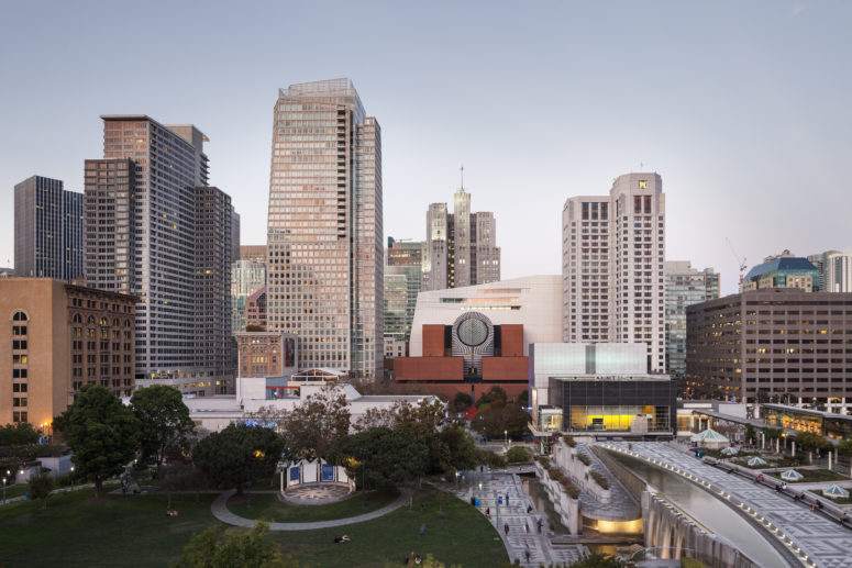
The new expansion runs contiguously along the back of the existing Mario Botta designed building. Photograph by Henrik Kam, courtesy of SFMOMA
Only Herzog & de Meuron escaped the SF curse, and that may be due to the fact that the new “DeDe De Young,” as the de Young Museum is known locally, was built with private funds raised by the city’s leading socialite, Dede Wilsey. The problem with destroying a building that is only 20 years old, like Botta’s SFMOMA, is that a lot of the donors, and of course their heirs, are still alive.
Without the Botta wing, it would look as if Doris and Donald Fisher, who have loaned their enormous collection to SFMOMA for a hundred years, had, as Roberta Smith pointed out in her review in the New York Times, gotten their private museum after all. Besides the politics of the more-than-one-percent, there would be the negative environmental message of destroying such a relatively new building.
Botta was trying to make a building that looked eternal, much as Louis Kahn did, with elemental forms and materials. But a curtain wall of nonstructural brick floating over a glass entry ended up looking more than a little silly. And the striped stone became a cliché of the postmodern era. I always liked the form of the oculus and the beacon it turns into at night. But instead of looking like a building for all time, it looked like something conceived in the late 1980s, which it was.
Dykers and Snøhetta have focused on the interior experience and then tried to make the very large shell look as light as possible. The most intimate moment on the exterior happens on the backside, where two alleys converge at the VIP entrance and, ironically, the loading dock. You could call it a happy San Francisco surprise. If only we had a drag club on Natoma.
The architectural image of the building plays a supporting role to the interior beauty. The circulation is a bit of a mystery, and each time I have been there, people have been looking for stairways, but so far the museum has a lot of staff in red T-shirts to guide you. Pretty soon the local habitués will get used to surprise, to “not here, over here” circulation. Most of us who have been trained to navigate weird circulation in the Westfield San Francisco Centre know where to look. And who cares about the tourists? They have all day.
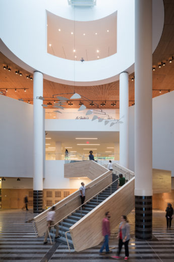
Photo Iwan Baan, courtesy SFMOMA
A great deal of effort was put into making the two buildings work well together in terms of experiencing the art. The height of the ceilings, along with the common floors and wall colors, allows visitors to move from gallery to gallery without necessarily registering which building they are in. A fellow architectural snob really disliked the placement of the windows, but that doesn’t bother me, and one long ribbon at the top of the building turns the employee lunchroom into a pretty fabulous after-hours reception space. The glimpses of the city are not predictable as you move through the galleries, but serve to remind you that you are not in heaven, but the middle of a city.
On the negative side, the expansion joints are about as clunky as can be. On one gallery floor is an interior window where you can see the two buildings meeting. Like looking in on a surgery, but it’s grey, not, well, whatever. A few friends said they really liked the green wall on one of the terraces. Green walls are like enormous floral arrangements. They have to be tended and fussed over. They are no more natural than those fabulous displays at the Metropolitan Museum of Art. I think of them as gratuitous sustainability—living wallpaper.
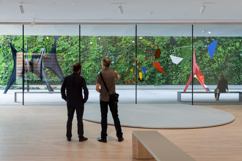
Alexander Calder: Motion Lab: The Fisher Collection exhibition. SFMOMA’s living green wall in the background. Photo Iwan Baan, courtesy SFMOMA.
The logo glued on the building looks like so much cardboard. While I like the logo on the tote bags—the one with the vertical stripes—the lettering seem like a last-minute substitution. The vertical stripey logo contrasts with the earlier horizontal stripey graphics. What I like about it, besides turning the stripes around, is that these stripes recognize the building’s main flaw and celebrate it. These are the joints on the fiber-reinforced plastic panels.
The building’s models (on display in the museum) suggest an iceberg, a plastic extrusion from a digital printer, or some other solid mass moving across the city’s landscape. The hundreds of little vertical lines that mark the joining of the off-white panels contradict this solidity.
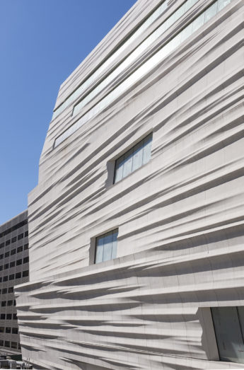
SFMOMA facade of Snøhetta expansion; photo Henrik Kam, courtesy SFMOMA
Others have criticized the edges of the building. But I like the sliced-off cake feel. If you are standing back a bit, the vertical joint lines begin to disappear, and you can really imagine this enormous confection slithering into place and then being tidied up at its ends. I can hear the sharp German knife slicing off the excess goop.
Snøhetta joins other contemporary architects like Renzo Piano and Tod Williams Billie Tsien Architects in looking for a solution that could be quiet, self-effacing, and dare I say, humble. The point of the work is service more than self-aggrandizement. The new wing isn’t perfect, but at least it’s not beating its chest. It’s a good little-big neighbor.
