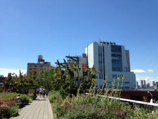
A New York summer day in the shade on weeks between rainstorms is sweet. Walk on the shady side of the street and you don’t sweat so much. Walking along the southern end of the High Line is slow with all the other tourists (the locals are upstate or at the beach), but the plantings have matured and some are in bloom. It’s an after-dinner European promenade all day long. What’s the rush to get anywhere? And now at the very end there is a large industrial-looking building with a simple but dramatic canopy. Swoosh, you are in the open lobby of the new Whitney museum. Architecture critics are not so sure about the building, but the artists love it. Renzo Piano isn’t worried. He designed the building to showcase art, not architecture. All of his buildings are almost antibuildings, even though his first big commission, the Pompidou, had to have some bright accents. Of the Whitney, Paul said, “It is self-effacing.” Perhaps Piano’s brand of self-effacement didn’t quite come off in the shadow of Eli Broad and Los Angeles, but it works in New York.
I worry that the rise of BIM, general contractors, and the privatization of the public sector spells doom for the profession of architecture. I think YouTube and social media will be more than a supporting player. The culture, aided by all those clicks, is in the throes of spectacle and incessant self-promotion. Frank Gehry, Zaha Hadid, and Rem Koolhaas are perfectly aligned. So when an architect like Piano isn’t melting a building or concretizing a Rube Goldberg drawing, he gets shade. Piano is a seemingly simple poem read live in a mind-numbing YouTube society.
From a distance, the Whitney looks like a memory of an industrial building rather than an actual artifact. It’s a stage set of sorts, with people moving up and down the large open web metal platform attached to its east elevation. On the top floor, the clerestories admit a perfect soft light. The clerestory is the brand—quite literally. The new logo can be found on all kinds of merchandise in the flexible gift shop on the main level, and it even appears on the floor of the elevator. The beautiful seams of the building show up in a special pale blue gray handbag designed by Piano for the wealthy visitor.
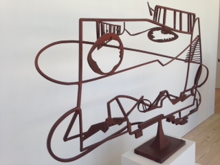
In my first visit, I found it hard to focus on the art and the building. To be sure, there are old favorites: a Rothko, a Hopper, an especially luscious Joan Mitchell, and an airy David Smith. But it was hard to focus on the theme—America is Hard to See—because one of America’s greatest accomplishments, New York City, can be seen out of a window, beyond a terrace. Not so constant as to distract, but frequently enough to bring the visitor back to exactly where he or she is standing—in the middle of a great American city. My main complaint was that the museum’s circulation was not obvious, and there were several bottlenecks, wrong turns, and alarms ringing.
Sitting down on a terrace or in the café, you can ponder what this exhibit means. I was tempted to count the number of artists who were either based in New York or whose subject was New York. The title of the opening exhibit brings to mind that famous Steinberg New Yorker cover that shows just how hard it is to see the country when the vantage point is Manhattan. This is why we need a museum dedicated to American art: to help us see the country again.
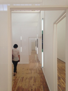
Saturday was another perfect dry summer day, and our little group met at Grand Central under the clock and took the train up the Hudson to Dia: Beacon. More factory clerestories! Looking down the two main galleries with the art on the floor (installations by Walter de Maria), you definitely feel like you have entered the Cathedral of Conceptual Art. This time I smelled the Joseph Beuys felt and didn’t feel like dancing in Serra’s somber Torqued Ellipses. Having just finished the new Agnes Martin biography (Agnes Martin: Her Life and Art), I focused on Dia’s significant holdings of Martin’s work. I thought they might be on loan to the big retrospective at the Tate, but there they were, shimmering in the diffuse summer light. The main purpose of this journey was to see Robert Irwin’s show, Excursus: Homage to the Square. I can’t explain the title, but as with the best of Irwin’s shows, you see movement: individuals become clear, then less clear, and then they vanish.
After our return, our posse had a glass of champagne in the courtyard of the apartment where we were staying and then went to Maialino, one of our favorite neighborhood eateries. That Danny Meyer knows how to run a restaurant!
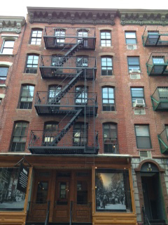
We slept in Sunday and wandered down to the Lower East Side, checked out the Essex Street market, which felt like Mexico, and then wandered into the Tenement Museum, which is a full-tilt tourist attraction complete with mall—well, huge gift shop. Years ago, I saw a play about the Triangle Shirtwaist Factory fire in one of the tenement basements. Our young pal Laura was a star. Now the museum has several tours focusing on a theme and just a few of the restored (replicated, really) apartments. But much of the building is in the condition it was left when it was abandoned in the 1930s. There are too many people on the tour to fit into each small room (the apartments had two small rooms and one tiny one). The idea of a coal stove burning all year to keep irons warm for pressing seemed intolerable. Instead of poorly paid immigrants in the Lower East Side, we have poorly paid garment workers in Asia today.
On Tuesday, we invited some editor friends and design comrades to our occasional SweatBox cocktail party at 41 Bond Street. One of the partners of DDG Development loaned us his super-swanky townhouse. DDG bucks the trend of many current New York developers: they care about design—a lot. They are the folks who are developing San Francisco’s 8 Octavia, designed by Stanley Saitowitz, and other projects in San Francisco by Gary Handel and Anne Fougeron. This year, nobody had to sweat. We had air conditioning! Afterward, we went to dinner at Il Buco, another great New York Italian restaurant. I indulged in rabbit sausage, another first.
