Warren Platner endures as a bright (if occasionally shiny) light from the 1960s and 70s. As an architect, he is best remembered for interiors and furniture design. Interiors tend to disappear, but furniture endures. Since his chairs for Knoll cost so much to make, the tables are the ones that most designers can readily identify. But it’s time to look at him again for his architecture too.
 |
| courtesty dwr.com |
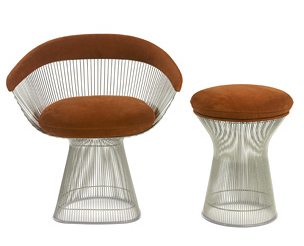 |
| KnollStudio® Platner Lounge Collection |
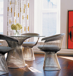 |
| KnollStudio® Platner Dining and Low Tables |
Like his former employers, Eero Saarinen and Kevin Roche, he was trying to break out of the ubiquity of corporate modernism—American style. Sometimes he could go overboard, but the excesses of postmodernism make his explorations look disciplined, if not exactly restrained.
His own house in Connecticut runneth over with multiple level changes, window seats, nooks, and luxurious materials. Makes me think of Christopher Alexander gone modern baroque. Like an excited kid sketching, he didn’t know when to stop. The living spaces suggest that he might have gotten too generous a discount at the furrier.
Alexandra Lange, one of my favorite design journalists, has written about Platner in Design Observer. A few years ago, her long piece used Platner’s bold use of brass as a jumping off point (see http://observatory.designobserver.com/entry.html?entry=12047
and
Platner was on my mind in early May when we were invited to venture out to Princeton for a Mother’s Day brunch. Oddly enough, we could not locate a map when we got off the train. Since we were early, we decided to wander around until we found our destination, the faculty club, guessing that it would be in the center of campus.
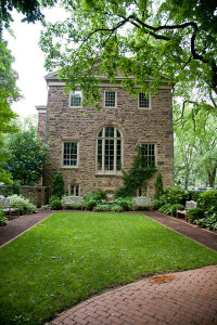
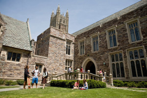
Thanks to an abundant landscape, Princeton University is still a beautiful campus. Just walking around, I got the impression that the school seems very conflicted about its architectural identity. This is a school that loves its history—in any era. A lot of revolutionary war events took place in the modest structures near the town/gown edge. Over time, commissioned architects borrowed heavily from the neo-Gothic and neo-Tudor. Sort of a U.S. university straight from central casting impersonating a (stone) British university.
 |
| Photo: Princeton University, Office of Communications. |
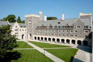 |
| Whitman Hall Photo: Princeton University, Office of Communications. |
 |
| Photo: Princeton University, Office of Communications. |
Occasionally that conflict gets resolved beautifully, like when Gwathmey Siegel, in its moment of modernist glory, repaired the Greek Revival Whig Hall after a fire by inserting a sculptural intervention (1972). For years, the school’s favorite architect seemed to be Venturi Scott Brown, who navigated the tension between old and new with a heavy tilt towards old. Brick with stone graphics.
More recently, the university seems to be looking forward with new buildings like Rafael Viñoly’s Icahn Laboratory (2002), Fred Fisher’s Sherrerd Hall (2008), and another engineering building on the boards by Tod Williams Billie Tsien Architects, But then at the same time, it just looked way backward with a neo-Hogwarts dorm and dining commons (2007). The monstrosity was built largely with funds from eBay zillionaire (and failed Californian gubernatorial candidate) Meg Whitman and of course is named for her.
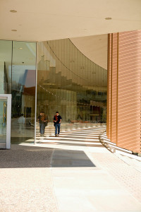 |
| Icahn Laboratory by Vinoly Photo: Princeton University, Office of Communications. |
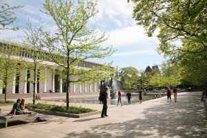 |
| Robinson Hall by Yamasaki Photo: Princeton University, Office of Communications. |
Earlier buildings such as Feinberg Hall by Williams-Tsien (1986) and Marx Hall by Kallmann McKinnell & Wood (1993) negotiate this tension of building modern in a neo-everything-goes context with grace, finding a thoughtful middle way. One of my favorite buildings was I.M. Pei’s unapologetically modern dorm, Spelman Halls. The interesting geometric plan offers the pedestrian a kind of dense walking experience drawn from the spatial experience, but not the literal forms of European universities.
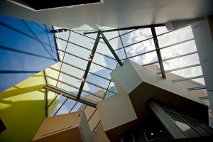
Of course there are the usual starchitect suspects sprinkled throughout the campus: the requisite Gehry silver lump, in this case the recent Lewis Library (2008); the squat and ungainly Pelli (a pool from 1990); some bizarre Yamasaki affairs (1965, 1966); and a much-needed lightening of the dour 1960s architecture school by Architectural Research Office (2008). I am eager to return to see all that I missed.
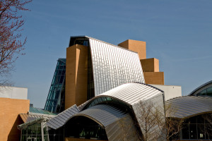 |
| Lewis Library by Frank Gehry Photo: Princeton University, Office of Communications. |
 |
| Lewis Library by Frank Gehry Photo: Princeton University, Office of Communications. |
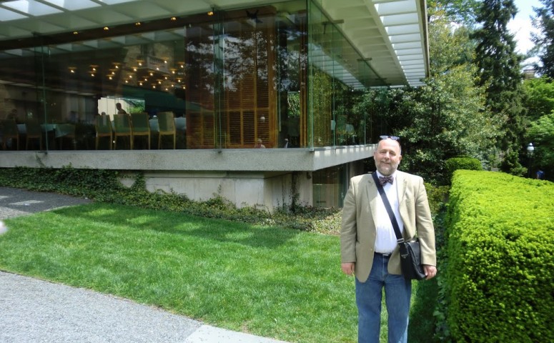
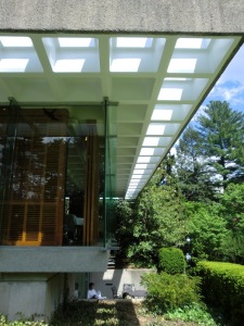
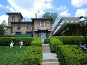
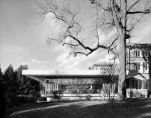
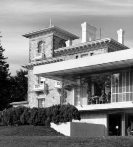
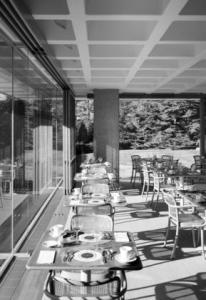
Our destination turned out to be the highlight of our tour. We came around the backside of Prospect House and saw the glass and concrete dining room in all its bold modern glory. I remembered it from Platner’s book Ten by Warren Platner. At the point in the late 1960s and early 70s when modernism held sway, Platner was commissioned (in some kind of collaboration with Pietro Belluschi) to renovate the school’s faculty club, which is housed in Prospect House (c. 1850), the university president’s house from 1979 to 1968. Platner didn’t make much of an effort to relate to the “context” or reflect the existing architecture in his addition. Instead, he just attached a concrete trellis to the back of the Victorian mansion to create a kind of grand screened porch for dining. He also refurbished many of the antique public areas with his own trademark furniture. Judging by our casual observation, that groovy early 1970s decor has been banished and returned to a vague historic blandness, but the dining pavilion remains largely intact. What a simple elegant joy it is.
 |
| Princeton Faculty Club, Location: Princeton NJ Architect: Warren Platner © Ezra Stoller/Esto |
 |
| Princeton Faculty Club, Location: Princeton NJ Architect: Warren Platner © Ezra Stoller/Esto |
 |
| Princeton Faculty Club, Location: Princeton NJ Architect: Warren Platner © Ezra Stoller/Esto |
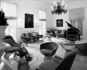 |
| Princeton Faculty Club, Location: Princeton NJ Architect: Warren Platner © Ezra Stoller/Esto |
The waffle slab ceiling has punched openings along the outermost trellis and along the one wall that attaches to the house. The balanced light, which can be modulated by the sliding wood shutters, provides a wonderful daytime dining experience. We were seated in the center of the room at a large table but could easily hear all of our dining companions. Looking out over the beautiful Prospect Gardens, the room nearly disappears. The building seems to be a mini-me of Platner’s Kent Memorial Library in Suffield, Connecticut (1973), which apparently has been saved.
If you’ve got a friend on the Princeton faculty, go have a meal there. (The corner glass detail alone is worth a visit!) Have your generous host take you on a walking tour of the campus afterward. Then you can go back and look again at Platner’s bold humility and be inspired.
p.s.
The Mother’s Day buffet was really good!
