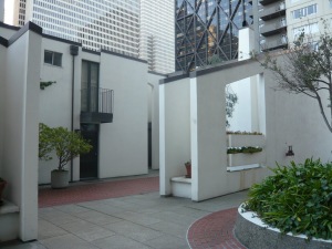
One thing about staying in the Bay Area most of my life is that when I notice subtle changes, I can exaggerate them into a cause for celebration! Often an improvement in the built environment also reminds me of a loss, a lament. Sometimes this happens within the same project.
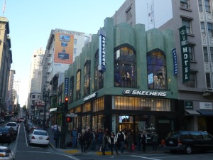
Not long ago I was walking down Powell Street and noticed that the green terra cotta building at the corner of O’Farrell Street has been restored and occupied. For years it was empty or unloved. The terra cotta parapet had been removed, giving the whole building a, unfortunate, scalped appearance.
The top layer has now been restored and so have the window casements. While it is true I have no interest in shopping at the new Skechers, I am happy to see this Art Moderne jewel from 1933 brought back to life. Gensler did a great job converting the former Cable Car Clothiers into contemporary retail. (But give me the old bowties any day!)

At the same time, I am reminded that Omar Khayyam’s Restaurant, which was in the basement of 200 Powell, has been lost forever. It was the first fancy restaurant our family visited once we knew how to behave in public. The owner George Mardikian served middle eastern food long before it was fashionable. He would bring out the special flatbread and actually break it with his guests and chat. Breaking bread was a symbol of hospitality, which he took seriously. The bread was thin yet bubbly. With a dab of rose petal jelly on top, it was an exotic treat for suburban middle class kids. I had never tasted something so exquisite. Then the dolmas would come, and we would have to ask for more in short order, because all three of us kids would devour them. I remember less about the entrees but more about the baklava for dessert, which we could peel gently with our fingers. And then finger bowls! We thought we were rich indeed.
It was also one of the most beautiful restaurants of a certain age. You entered on O’Farrell and descended to a lower level that never felt like a basement. On the landing there was a photo of Rudy Vallee, although I can no longer remember the connection. On the left at the bottom of the stairs was the Rubaiyat lounge with velvet banquettes, low Persian lamps, and a gleaming chrome cash register. We never waited there because our table was always ready when we arrived. I remember deep scarlet velvet upholstery like the seats at the La Scala Opera House. Paintings of images from the Rubaiyat adorned the walls, and the lighting was never harsh. For several years, you could buy their rose petal jam, but no more. (There are other purveyors online however.) I love remembering the colors, deep scarlet, rose red, and pink linens. It is an important early design memory.
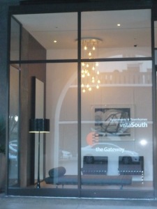 On the other side of downtown, one of my favorite modern mixed-use complexes has been getting a much needed makeover. They have been updating, or should I say backdating, their lobbies.
The Golden Gateway, a redevelopment project from 1965, has removed its silly overstuffed sofas and renovated its lobbies to be more in keeping with the original design. Melander Architects and Orlando Diaz-Azcuy have brought it back into contemporary glory. I love the Barcelona chairs, but the spaces could use a bit more punch. In the building facing Battery Street, the original mosaic on the mezzanine balcony helps, but some of the art is too monochromatic for my taste. However, architect Kurt Melander tells me that they will be bringing some of the original abstract paintings back, which is great news.
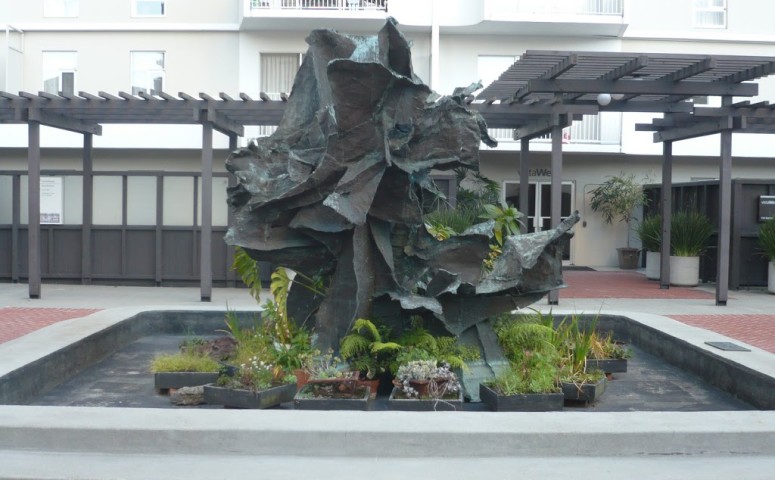
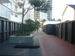
The complex, which originally involved some of the best local architects of that day, like Anshen+Allen, Wurster Bernardi & Emmons, Joseph Esherick, and DeMars & Reay, was criticized for raising so much activity on the podium above the street. And yet much of the retail at the street level has survived. One detail worth nothing is the handsome new light fixtures along the arcade. There are a few blank walls (handsomely detailed though) that once faced the on- and off-ramps of the now demolished Embarcadero freeway. But the gardens above the street are wonderfully scaled, intimate and mysterious, and still open to the public. Often I go out of my way to walk up and through the courtyards. They have staying power. 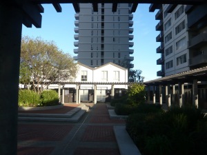
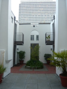
A few of the townhouses have new exterior lanterns that look like they were stolen from a Long John Silver’s restaurant. I hope they are temporary.
My main lament is over the changing of the buildings’ names and the new signage. One of my pet peeves is the overuse of branding. It’s one thing to spend a lot of time thinking about how to convey the personality of a tennis shoe or a soft drink, but so often branding architecture seems to lead to corporate nothingness. The original folks at the Golden Gateway (now the Gateway) came up with some very good graphics and names for the apartment buildings.
Since they were creating something so modern in the mid-60s at what was once the water’s edge, indeed in the water perhaps, they referred to San Francisco’s maritime history to add a bit of legitimacy and maybe mystery. When the complex was finished in 1965, I suspect a fair number of folks knew something about the characters the buildings were named after, but I suppose with the passage of time, they have been forgotten?
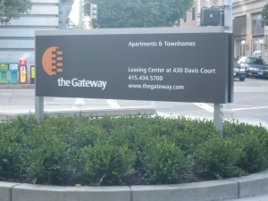
The building now known as Vista West (how dull is that?) used to be the Richard Henry Dana. As any student of California knows, Richard Henry Dana was the author of Two Years Before the Mast,based on the diary of his journey aboard a ship that sailed from California to Boston. The square tower immediately to the east, now known as Vista North, was Buckelew House. It was named after Benjamin Rush Buckelew, the publisher of an early newspaper, the Californian. Further east, renamed Vista South, was Macondray House. Macondray is probably best known as the lane that was renamed Barbary Lane in the Tales of the City series. But Frederick William Macondray was a Boston sea captain who ventured west with the Gold Rush and became a prominent early businessman in San Francisco. The other slender slab, Vista East, was named after William Heath Davis, another early businessman and ship owner. I would rather say I live in the Richard Henry Dana or the William Heath Davis than the Vista whatever.
To be fair, the new website (thegateway.com) is a vast improvement over the old site. But sometimes design doesn’t need to be updated, just maintained. Think how much money the owners of the Golden Gateway would have saved if they had kept the original lobby design and names?
